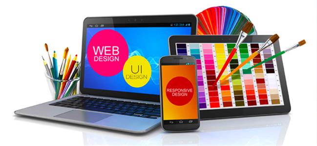
Web design trends continue to change as technology and user expectations evolve. Keeping up with these trends helps businesses improve user experience, maintain a professional appearance, and stay competitive. A well-designed website can strengthen brand image, support marketing goals, and increase engagement.
To achieve these results more efficiently, explore a range of web design tools that can simplify the design process and help create modern, user-friendly websites.
Why Staying Updated with Website Design Trends Matters for Your Business
Should your company adopt the current website design trends, or should it continue with a classic look? This is a prevalent question among businesses, entrepreneurs, and professional bloggers alike. With competitors continuously changing their websites to look new and relevant, the urge to keep up is difficult to resist. Staying up to date on design trends may benefit your company in a variety of ways.
Here’s why keeping up with design trends is important:
- Enhance your brand identity by using design elements that reflect your ideals and personality;
- Show your audience that your business is up-to-date and receptive to current trends;
- Improve the user experience and make your website more exciting to keep your brand memorable;
- Maintain competitiveness by adapting to changing client preferences and industry standards;
- Avoid seeming outdated or unprofessional, which might jeopardize your trust;
- Stand out from the crowd with a fresh, vibrant website;
- Showcase your knowledge by using fresh design methods;
- Identify new growth opportunities, as trends often reflect what customers expect and value.
While you do not have to follow every trend, disregarding them entirely might undermine your internet profile. With over 250,000 new websites launched each day, competition for attention is only increasing. Reviewing trends on a frequent basis helps keep your website on track with your marketing objectives and guarantees your company’s visibility and relevance online.
Challenges of Adopting Website Design Trends in 2026
Following website design trends can help you find growth possibilities and boost your brand, but using them without careful analysis might backfire. Website upgrades, as opposed to email or social media designs, need time, expertise, and resources. Changes are more difficult to reverse once they have been implemented, therefore new styles and features must be approached with caution. Design trends may have an influence on SEO, user engagement, and company image.
For example, introducing gamification elements may increase interaction while slowing down your website, resulting in poorer search rankings. Many trends are short-lived. Adopting a trend that does not align with your brand or confuses customers may undermine trust and customer relationships.
Before applying a trend, ask these questions:
- Does it align with your brand values and messaging?
- Will it appeal to your audience?
- Can it improve visibility or relevance?
- How will it affect marketing, sales, and user experience?
- Is it growing in popularity or already losing relevance?
Adopting design trends should be a strategic decision. In some cases, sticking to your brand’s style delivers better results. In others, updating your design helps maintain user interest and loyalty. Careful selection protects your brand while allowing you to track user behavior and preferences. Below are 2026 website design trends to consider for inspiration and planning.
What to Expect from Website Design Trends
Focusing on Mobile-First Design and AMP for Better Performance
Not only are mobile-first design and accelerated mobile pages (AMP) 2026 trends, but they are also necessary components of any contemporary website. Businesses are disadvantaged by ignoring them, which results in lost chances for search engine exposure, user engagement, and traffic growth.
Website design accounts for more than 90% of a user’s initial perception of a brand. This immediately influences engagement, market position, and income. With mobile devices accounting for around 60% of all website traffic, concentrating on mobile-first design has become an essential approach in 2026.
A website must work equally well on desktops and mobile devices, but mobile should be the priority. Recent data highlights the importance of this approach:
- More than 80% of U.S. customers make purchases with mobile devices;
- Smartphones account for more than 50% of all page visits;
- 40% of users will leave for a competitor after a poor mobile experience.
Furthermore, Google’s mobile-first indexing ensures that search rankings are highly influenced by a site’s mobile version. Mobile-first design and AMP are now required for continued exposure in search results.
By using this strategy, businesses may increase conversion and revenue, enhance user experience, and meet market expectations. Businesses that put a high priority on mobile performance position themselves for sustained success.
Here are practical steps to follow when applying mobile-first design principles:
- Prioritize crucial content: Put the most critical information first. Use an “above-the-fold” layout to ensure consumers notice important material right away. Avoid using ornamental components that aren’t relevant to the content;
- Simplify navigation: Make it easy for people to move through the website. Use hamburger menus or navigation drawers that are always available;
- Optimize visual elements: Use mobile-friendly photos, graphics, and animations. Avoid using large wide-format photographs or complex visualizations, which might slow down performance. The most effective graphics are branded and mobile-optimized;
- Design for touch: Increase the size of buttons and clickable areas to facilitate navigating on smaller displays. Use movements such as pinch, swipe, and tap when applicable;
- Rethink hover effects: Hover and mouseover interactions are ineffective on mobile devices. Replace them with features that operate on touchscreens;
- Improve interactivity: Treat the mobile version as an interactive app. Include off-canvas menus, expandable widgets, and AJAX content loading to decrease page refreshes.
Mobile-first design and AMP are no longer optional. Prioritizing them ensures better performance, improved user experience, and stronger search rankings in 2026.
Color Trends
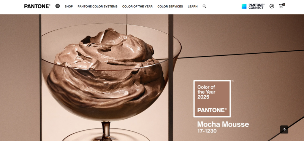
Web design will favor color palettes that maximize digital comfort and prevent eye strain. While former years have concentrated on bright, vivid colors that draw attention, current trends favor softer and warmer tones that produce a more pleasant browsing experience.
These color schemes are intended to make websites seem more welcoming and user-friendly while maintaining visual attractiveness. Rich, warm tones are employed to intuitively guide visitors through the text, while multi-tonal schemes offer depth and complexity. This combination promotes engagement while also providing a comfortable visual experience. Mocha Mousse, Pantone’s 2025 Color of the Year, embodies this trend with its delicate and warm tones.
Typography Trends: Bold and Expressive Fonts
Typography in web design is evolving, with a heavy emphasis on bold and expressive fonts that help capture attention and effectively define the brand.
Variable fonts are gaining popularity because they provide numerous design possibilities while boosting page loading performance. At the same time, serif fonts are making a resurgence, particularly in headlines and call-to-action components, to lend a more classic or warm vibe.
Another popular style is maximalist typography, which uses huge, stacked letters to produce a striking visual impact. Designers also use serif and sans-serif typefaces to add contrast and structure. Custom, fun fonts are being utilized to give websites a personality. Overall, typography is today seen as both a useful tool and an important component of how a company expresses its message online.
Anti-Design and Human Elements
Anti-design is gaining attention as more websites move away from polished, traditional layouts. This trend features asymmetry, unbalanced structures, overlapping elements, and clashing colors. The goal is to break design rules and create unique, experimental layouts that feel less manufactured and more authentic.
Anti-design isn’t for every website, but it’s becoming common in creative spaces and social media platforms. These intentional imperfections help build stronger user connections by adding a human touch. Instead of aiming for perfection, websites focus on authenticity and relatable experiences.
Sustainable Web Design 2.0
Sustainability in web design is evolving. It goes beyond optimizing load speed and now focuses on reducing the environmental impact of websites at every stage of development. Designers and developers prioritize efficient coding, media optimization, and eco-friendly hosting services.
The goal is to lower digital carbon footprints while improving website performance. These practices not only support environmental responsibility but also create faster, more user-friendly websites. Sustainability has become a core design principle, combining user experience, functionality, and environmental impact.
Experimental Navigation
Navigation will become more interactive and imaginative in 2026. Many websites are replacing standard menus and dropdowns with experimental navigation strategies that aim to engage visitors.
Examples include immersive scrolling effects, animated transitions, 3D objects, spatial interfaces, and non-linear routes. These tactics are especially popular on creative and portfolio websites, where they encourage user involvement and keep users interested for longer.
While experimental navigation adds flavor and uniqueness, it must be effective. The aim is to provide a distinctive experience without compromising usability or making navigating difficult.
Bold Layouts with High Contrast
Large block layouts with vivid color contrasts are another growing trend. This design style, similar to what Canva uses, combines strong visuals with practical navigation.
The use of color blocks helps guide users through content naturally while adding visual interest. Each section can highlight different products, services, or messages while contributing to the overall design flow.
When applied thoughtfully, this approach enhances storytelling, supports branding, and keeps websites engaging. It works especially well for creative businesses, SaaS platforms, and brands that target design-focused audiences.
Brutalist Design
Web design is seeing a renewed interest in brutalist principles. This style stands out for its bold typography, basic layouts, and raw, unpolished elements—offering a direct contrast to the refined, template-based designs that have dominated in recent years.
Modern brutalism draws inspiration from sources like RAW magazine and punk rock style. The focus is on simplicity and authenticity—stripping away unnecessary decorative features to emphasize content and function.
What makes this new wave of brutalism interesting is its structured approach. Designers use monochromatic color palettes, grid layouts, and a few images to achieve a clean but dramatic design. This technique enables companies to portray themselves honestly and stand out in a congested digital market.
The goal is not to make websites hard to use but to create straightforward, human-centered designs that break from overly polished norms while remaining functional and modern.
Motion Design
Web animation trends are shifting. Instead of relying on constant motion or heavy 3D elements, designers are using animations more selectively. The focus is on adding motion only where it improves the user experience.
Purposeful motion helps highlight important content, improves interaction, and avoids overwhelming visitors. This approach also enhances site performance and reduces visual clutter, resulting in websites that feel more refined and user-friendly.
Prioritizing Negative Space for Cleaner Layouts
Designing using negative space is incorporating empty spaces around the material to produce a clean, uncluttered look. This method highlights text, graphics, and buttons, increasing readability and keeping users focused. Using margins, padding, and line spacing separates sections without overwhelming users. A clear hierarchy with varied font sizes and weights naturally guides attention. Reducing clutter enhances user experience, with Apple.com remaining a strong example of this approach.
Interactive 3D Elements for Engaging Experiences
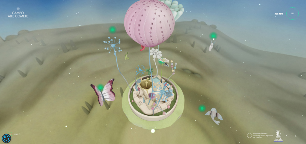
Web technology advancements and the demand for interactive websites have made 3D models a popular feature in 2024. Sites like Campo Alle Comete show how interactive 3D content creates visually impressive experiences. Using 3D models for products allows visitors to explore every detail, offering a more realistic view that can increase confidence and conversions. The focus shifts toward using 3D content thoughtfully to support user engagement.
Adding Gamification for User Engagement
In order to promote interaction and maintain user engagement, gamification entails incorporating challenges, points, or awards into websites. Features like contests, polls, calculators, and quizzes are valuable and aid in gathering pertinent user data. A mortgage calculator on a real estate website, for instance, may be included to help consumers collect data depending on their inputs. Lead generation may be enhanced and engagement raised using this strategy.
Using Organic Shapes for Better User Flow
Organic shapes have evolved beyond decoration and are now used to support storytelling and guide navigation. These natural, flowing forms help create intuitive user experiences, especially when combined with interactive elements or micro-animations. Websites like Microsoft’s Surface pages use fluid shapes to blend product images with natural scroll paths, keeping users focused while aligning with brand identity.
Purpose-Driven Videos to Increase Engagement
Video remains one of the most effective website features for boosting engagement and building trust. However, modern web design trends favor purposeful, well-produced videos over generic clips. Videos should answer common questions or explain key topics clearly, making the website a useful resource while positioning the brand as an industry authority. One high-quality video can outperform multiple generic ones.
Bold Text-Only Hero Sections
Instead of relying on background images, many websites now feature hero sections with large, bold typography. This approach is designed to grab attention immediately, similar to how newspapers place top stories above the fold. Using unique fonts in the hero section helps websites stand out and communicate key messages quickly to visitors scanning the page.
Custom Illustrations for a Unique Brand Identity
Custom illustrations are replacing generic stock images in modern web design. Tailored graphics help represent a brand’s identity more accurately, making websites visually distinct and more engaging. This shift reflects a growing preference for original visual content that supports storytelling and strengthens brand recognition.
Dark Mode for Visual Comfort and Modern Design
Dark mode offers both functional and visual benefits. It reduces eye strain for users spending long hours on screens and gives websites a sleek, modern look. This design choice allows key elements to stand out while providing a more comfortable browsing experience, especially in low-light settings.
Data Visualization for Clearer Communication
Presenting data in a visual format helps simplify complex information and makes it more engaging. Charts, infographics, and graphs turn raw data into easy-to-understand visuals that capture attention and support key messages. Data visualization not only improves comprehension but also strengthens user interest in the content.
Combining Photography with Graphics for Impact
Mixing photos with graphic elements is gaining popularity as a way to make images more engaging and visually appealing. This trend, often seen on social media, is now common in web design, where overlapping graphics reinforce branding and maintain visitor interest throughout the page.
Progressive Forms Integrated with CRM Systems
Progressive lead forms adjust based on where a user is in the sales funnel, helping websites gather information without overwhelming visitors. These forms change dynamically, asking for basic details first and requesting more information during later interactions. By integrating with a CRM, forms can recognize returning visitors and skip fields already completed, improving the user experience and increasing conversion potential.
Voice-Activated Features for Easier Navigation
With the rise of virtual assistants and voice search, websites are gradually adopting voice-activated interfaces. While not yet common across all websites, this trend is expected to grow as users become more comfortable accessing information through voice commands instead of typing.
Building Ethical, Sustainable, and Accessible Websites
Ethical and sustainable website design is becoming more important as consumers increasingly expect brands to consider their impact on society and daily life. What started as a niche trend is now gaining momentum as more people seek out companies that practice social responsibility.
Research from Embryo shows the growing demand for ethical and eco-friendly business practices:
- 92% of people trust brands that are socially responsible or environmentally friendly;
- 81% prefer marketing that reflects eco-friendly values;
- 42% are willing to pay more for products made using sustainable methods.
Ethical marketing statistics show similar patterns:
- 34% of customers stopped buying from brands that showed little ethical concern;
- 37% chose brands based on ethical values or practices;
- 65% consider privacy protection important when shopping online.
Nearly 90% of consumers are more likely to stay loyal to companies that support social and environmental causes. This trend is expected to influence website design even more in 2026 as businesses adjust their online presence to meet customer expectations.
Companies are now using website design as a way to show their commitment to ethical, sustainable, and accessible practices. Below are practical ways businesses are incorporating these values into their websites.
Sustainable Website Design
Sustainable design focuses on minimizing the environmental impact of a website by reducing energy usage, lowering the carbon footprint, and improving overall efficiency. This is achieved by improving usability, content structure, and performance. Key strategies include:
- Using minimalist designs and simple user experiences;
- Structuring information clearly and logically;
- Providing direct and relevant content;
- Selecting system or open-source fonts like WOFF and WOFF2;
- Optimizing images and choosing lighter file formats or monochrome color schemes;
- Implementing responsive, mobile-friendly layouts.
Ethical Website Design
Ethical website design prioritizes the rights and well-being of users by focusing on accessibility, privacy, security, and user experience rather than just visual appearance. Core areas include:
Accessibility and Inclusion
Designing for accessibility means ensuring that all users, including those with disabilities, can access content easily. Recommended practices:
- Use clear and simple language;
- Maintain high readability;
- Ensure proper contrast ratios;
- Avoid visuals that cause eye strain;
- Support screen readers with essential information.
Privacy and Security
Protecting user data and ensuring transparency builds trust and helps brands comply with regulations. Important steps include:
- Adding clear and informative cookie consent pop-ups;
- Including branded elements that allow users to customize their privacy settings;
- Creating easy-to-find privacy policies and disclaimers.
Device-First Layout
An ethical website design considers how users access and interact with content. Businesses are moving toward layouts that work well on all devices, including desktops, tablets, and phones, while also supporting various input methods like keyboards, mice, and assistive technologies.
Development and Technology
Technology choices impact both user experience and environmental footprint. Ethical development involves:
- Using green web hosting services;
- Avoiding unnecessary plugins that slow down the website;
- Choosing optimized, minimal plugins that improve performance without adding unnecessary features.
By focusing on sustainability, ethics, and accessibility, businesses in 2026 can create websites that meet user expectations, protect user rights, and reduce environmental impact.
Enhancing User Experience with Meaningful Interactions
As user behavior, engagement, and retention become key focus areas, website design is shifting from purely visual appeal to creating functional and personalized experiences. The goal is to build purposeful interactions that help users navigate a website, understand content, and stay engaged. This approach is now standard practice in modern web design.
Meaningful interactions refer to user actions that provide clear value and support progress through a website. Not all interactions qualify — only those that improve usability or convey important information contribute to a better experience.
Several methods can create meaningful interactions and improve user engagement. Among them, dynamic cursors and micro-interactions are expected to remain popular in 2026.
Dynamic Cursors
Dynamic cursors started as a novelty but are now widely used to improve website navigation and guide users. They help highlight important information, support storytelling, reduce confusion, and make websites easier to use while still adding visual interest.
Common dynamic cursor effects include:
- Dot cursor: Helps direct attention to specific content;
- The following cursor: Makes the pointer more visible, and useful for content-rich layouts;
- Gradient or rainbow swirl cursor: Tracks user movement on content-heavy pages;
- Flashlight effect: Highlights key areas, especially effective in dark mode designs;
- Text cursor: Displays hints or branding elements;
- Arrow cursor: Aids navigation and helps users move through the website easily;
- Trailing cursor: Adds movement in simple or minimal designs.
These features not only improve navigation but also contribute to better usability and a more engaging experience.
Micro-interactions
Micro-interactions are small design elements that guide users and improve interaction with the website. They help with tasks like confirming actions, providing feedback, or offering visual cues during processes.
Used effectively, micro-interactions can:
- Improve usability;
- Increase user engagement;
- Support accessibility;
- Strengthen the user experience on mobile devices;
- Build a connection between the user and the brand.
Micro-interactions are typically categorized into triggers, rules, feedback, loops, and modes. To use them effectively, identify moments where interaction improves the experience — such as during registration, first-time visits, empty states, task completion, loading screens, or data displays.
The focus should be on functionality first, ensuring each micro-interaction has a clear purpose. Once the core interaction is defined, enhancements can be added to make the experience more engaging without distracting from usability.
Creating Engaging and Entertaining Websites
Websites designed to entertain and engage users continue to grow in popularity. These projects allow designers to explore creative ideas, experiment with new techniques, and push the boundaries of design and technology.
Entertainment-focused websites attract not only designers and developers but also general audiences. In challenging times marked by stress, economic uncertainty, and global events, people seek online spaces that offer relief, distraction, and enjoyable experiences. Websites designed with playful and entertaining elements help meet this need by offering moments of relaxation and engagement.
As a result, these websites often see higher traffic, longer user sessions, and better engagement. They also contribute to brand visibility and support marketing efforts by leaving a lasting impression on visitors.
Looking ahead, this trend will continue to evolve as designers explore more advanced technologies, AI, and personalization. These elements will help create even more interactive and immersive experiences.
If you plan to develop a website focused on entertainment and engagement, consider the following approaches:
- Include interactive elements that encourage users to explore the site;
- Use custom illustrations to capture attention and keep visitors engaged;
- Provide users with control over their experience, making navigation intuitive and user-friendly;
- Apply parallax effects to create layered storytelling experiences;
- Use smooth transitions to improve the flow of scrolling and browsing;
- Plan animations and hover effects carefully to enhance usability;
- Add interactive content such as quizzes, polls, or calculators to increase engagement;
- Follow modern graphic design trends to maintain a fresh and updated appearance;
- Consider gamification features to make the experience more enjoyable.
Experimenting with these techniques helps create websites that entertain while supporting business goals. For those looking for an easy way to build such projects, platforms like Slides, a no-code website builder, offer useful tools to create animated websites quickly and efficiently.
AI Integration in Website Design and Development
Artificial intelligence has become a widely used tool in web design, with most designers now incorporating it into their workflows. AI usage in web projects is expected to grow even more. Recent surveys show the most common uses of AI among web designers:
- Around 60% use AI to generate images, illustrations, and graphics for websites;
- 50% rely on AI to create full web page designs;
- 49% use AI for creative testing and trying new design concepts.
AI-powered platforms are gaining popularity because they help designers improve design quality from multiple perspectives, including marketing, branding, and advertising. Below are the main areas where AI is expected to shape website design:
Streamlining the Design Process
AI website builders will help designers create websites faster. Tasks like generating code snippets or building mockups can now be completed in minutes, reducing time and effort while speeding up project delivery.
Generating Content and Visuals
AI is often used to fill websites with text, images, and graphics. While AI-generated content should be used carefully due to quality and SEO concerns, it can be effective for temporary projects, presentations, or A/B testing.
Improving User Experience and Usability
AI tools help designers understand audience preferences and user behavior. This information allows designers to create layouts that improve user experience, engagement, and help businesses achieve their goals.
Identifying Weak Areas in Design
AI’s analytical capabilities make it useful for evaluating web projects. Designers can use AI to detect weak points, inconsistencies, and areas that need improvement during rebranding or updates.
Supporting Personalized Marketing
Personalized marketing is increasingly important. AI helps create dynamic content, adjust layouts, and suggest products based on user data. This approach increases engagement and improves conversion rates.
Integrating AI Chatbots
Chatbots and virtual assistants are now a common part of websites. About 40% of millennials interact with digital assistants daily, and chatbots handle nearly 39% of business-to-consumer conversations.
Designers play a role in developing chatbots by creating visually appealing and functional interfaces that improve customer service. While chatbots can’t replace human support, they help businesses respond quickly to common questions and improve overall user experience.
Designing Impactful and Complex Hero Sections
Hero sections play a critical role in shaping how users perceive a brand and helping businesses meet their marketing goals. Positioned at the top of a webpage, this area is often the first thing users see. It remains one of the most effective ways to apply the “above-the-fold” strategy, capturing attention right away.
The importance of well-designed hero sections will continue to grow as designers look for new ways to handle shrinking attention spans. Below are key approaches that can help create strong, engaging hero areas:
Use Abstract Illustrations
Custom illustrations work well in hero sections, but abstract or unconventional designs are more likely to stand out. Instead of choosing generic graphics, use illustrations that are unique and eye-catching. This approach helps your website grab attention quickly and distinguish itself from competitors.
Apply a Deconstructed Design
Moving away from traditional layouts, the deconstructed style uses fragmented elements such as bold typography, overlapping images, tilted graphics, and data visualizations. This design breaks the usual structure and creates a more dynamic and experimental look, allowing for unique storytelling and better engagement.
Add a Clear and Effective Headline
Visual elements alone are not enough. A strong headline with two or three clear, branded phrases is necessary to communicate value and guide users. The headline should reflect the brand’s message and encourage visitors to continue exploring the website.
Include a Prominent Call-to-Action (CTA)
A clear CTA button in the hero section helps users understand the next step. Studies show that CTAs placed above the fold perform significantly better. To be effective, the button should be large, highly visible, use action-oriented language, and provide clear instructions.
Enhance with Animations and Dynamic Effects
Animations and interactive effects continue to grow in popularity. Adding subtle motion to the hero area can improve user experience, highlight important content, and create a modern, engaging appearance. Options include dynamic cursors, morphing shapes, liquid motion, claymorphic styles, stop-motion effects, and hover animations.
Explore VR and AR Integration
Virtual Reality (VR) and Augmented Reality (AR) are becoming more common in web design. These technologies allow users to interact with products and environments directly on the site. For example, e-commerce platforms use AR to help customers visualize products in their homes, while travel sites offer virtual tours.
However, widespread adoption of VR and AR is still limited due to high costs, slow user adaptation, and the need for additional resources. In 2025, these technologies will mainly be used by industry leaders as part of larger marketing strategies rather than becoming standard in most websites.
Conclusion
Staying informed about web design trends helps businesses make better decisions when updating their websites. Not every trend will suit every brand, but understanding what is shaping the industry allows companies to improve user experience, support marketing goals, and remain competitive. Careful evaluation of new design approaches ensures that updates align with business objectives and audience expectations.